
1. Overview
2. Empathize & Define
3. Ideate & Design Mobile App
4. Finalizing App Design
5. Responsive Web Design
6. Test the Prototype
5. Going Forward
1. Overview
Task:
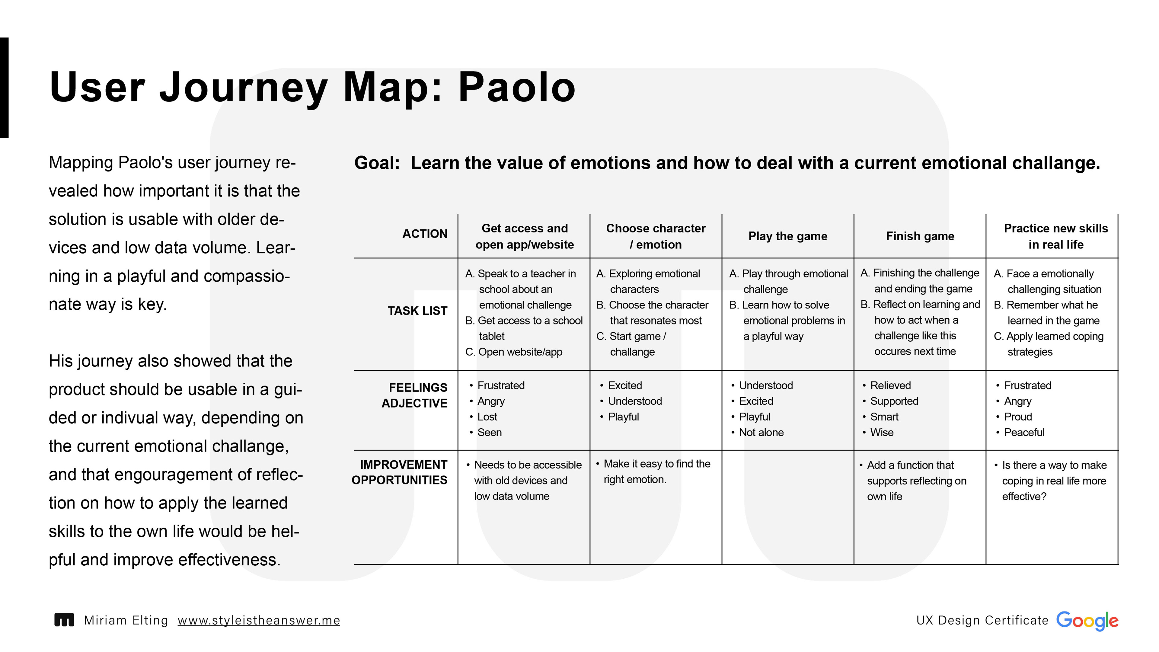
Design a tool to help teens and young adults learn about emotional intelligence
Design a tool to help teens and young adults learn about emotional intelligence
Product:
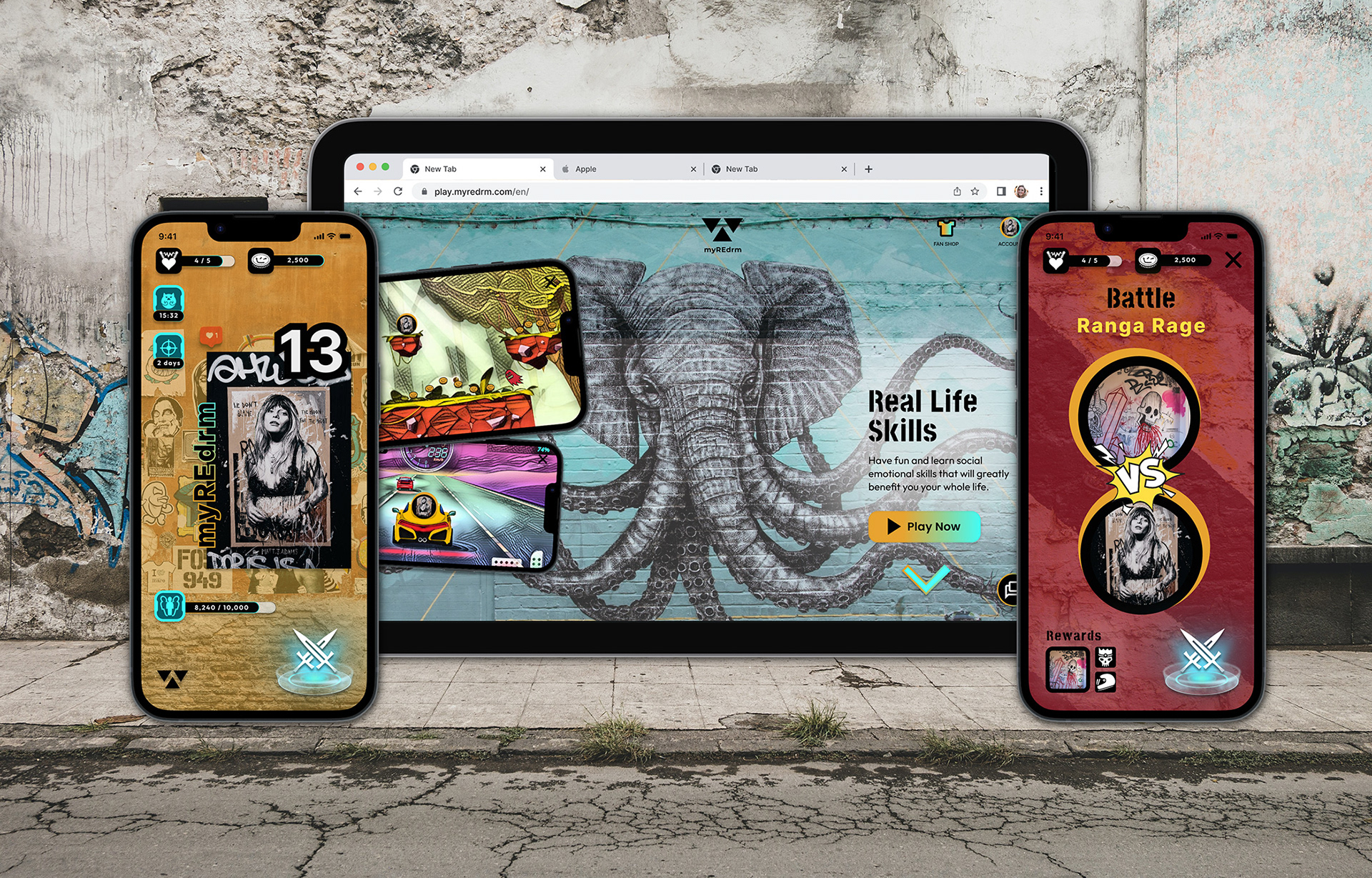
myREdrm Monsters is a game that can be played via mobile app and website. The goal of the product is to teach young adults social emotional intelligence and health in a fun and playful way. myREdrm Monsters primary target users include students and young professionals between the ages of 14 and 21 who have difficulty dealing with their own emotions and those of others.
myREdrm Monsters is a game that can be played via mobile app and website. The goal of the product is to teach young adults social emotional intelligence and health in a fun and playful way. myREdrm Monsters primary target users include students and young professionals between the ages of 14 and 21 who have difficulty dealing with their own emotions and those of others.
Problem:
For many generations, emotional intelligence has been neglected. Especially in socioeconomically less favorable environments and countries, young people do not learn how to deal with emotions in a meaningful way, especially those that are considered negative. Parents who have never learned this themselves cannot teach this to their children and so the generations remain trapped in this negative spiral. There is also a lack of awareness in these environments about how important education is in this area is.
For many generations, emotional intelligence has been neglected. Especially in socioeconomically less favorable environments and countries, young people do not learn how to deal with emotions in a meaningful way, especially those that are considered negative. Parents who have never learned this themselves cannot teach this to their children and so the generations remain trapped in this negative spiral. There is also a lack of awareness in these environments about how important education is in this area is.
Goal:
The goal of this project is to teach emotional intelligence to teenagers and young adults worldwide in a fun way that is not perceived as learning. For this purpose, a mobile app and responsive website is being designed.
The goal of this project is to teach emotional intelligence to teenagers and young adults worldwide in a fun way that is not perceived as learning. For this purpose, a mobile app and responsive website is being designed.
My Role:
UX designer and researcher leading the app and responsive website design from conception to delivery
UX designer and researcher leading the app and responsive website design from conception to delivery
Responsibilities:
Conducting interviews, determining information architecture, paper and digital wireframing, low and high-fidelity prototyping, conducting usability studies, accounting for accessibility, iterating on designs, and responsive design.
Conducting interviews, determining information architecture, paper and digital wireframing, low and high-fidelity prototyping, conducting usability studies, accounting for accessibility, iterating on designs, and responsive design.
2. Empathize & Define
Understanding the user
User Research: Summary
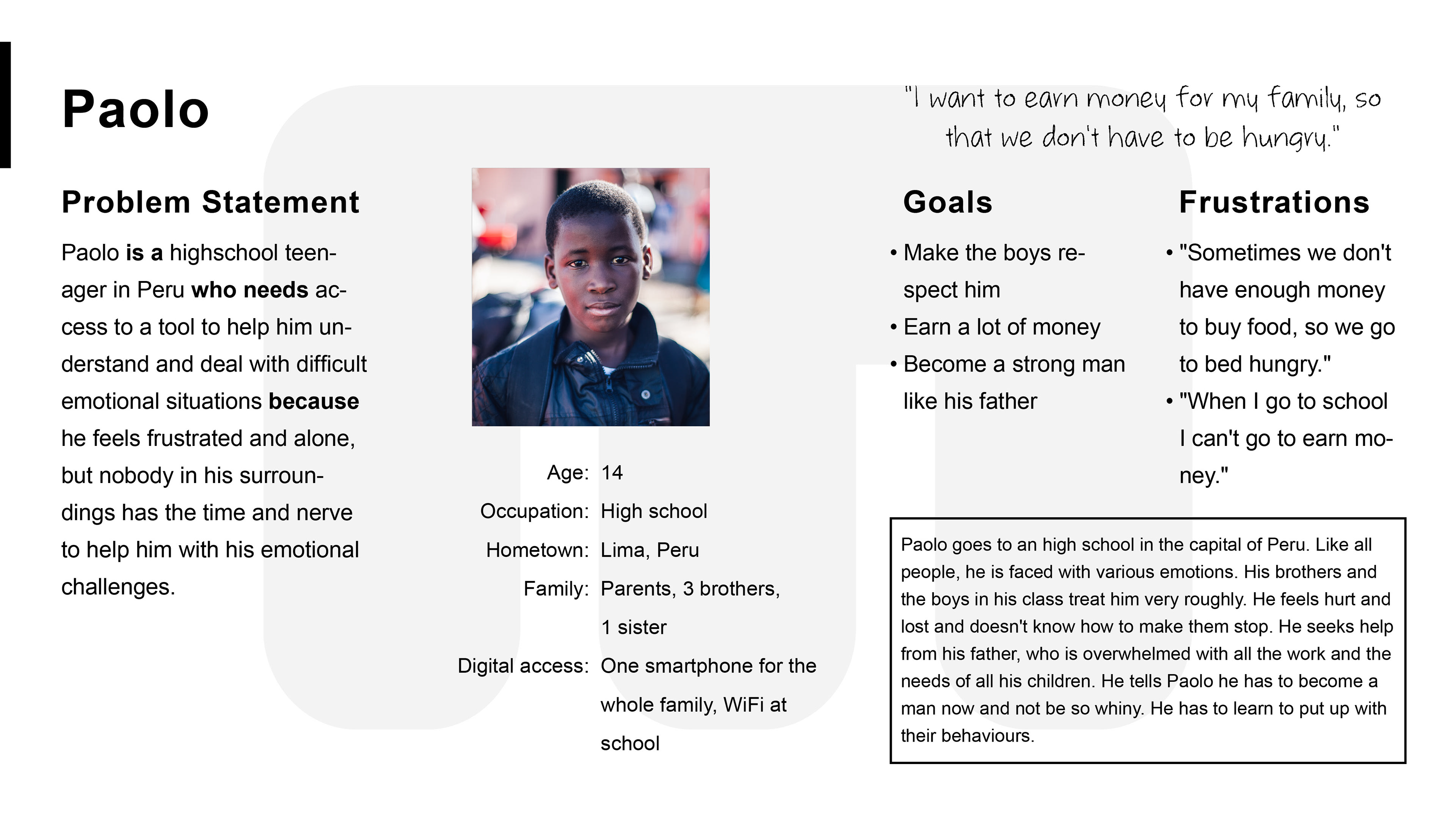
Initially, the idea was to develop a product that would teach children about emotions. However, early research showed that there is already a wide and high-quality range of digital and physical products available. But the research clearly revealed a gap in the market for helping teenagers and young adults deal with negative emotions in themselves and others, and thus build emotional intelligence. If they receive support in recognizing their emotions, finding out what triggers them and how they can deal with them and use them to their advantage, this has extensive positive effects on themselves, their development and their entire environment.
I conducted interviews with the target group and their caregivers and created empathy maps. It became apparent that awareness about the importance of emotional teaching is often lacking and that no active steps are taken to promote and increase emotional intelligence and health. It was also apparent, however, that many teens and young adults (and their caregivers as well) have difficulty managing their emotions and those of others. This particularly affects the economically more disadvantaged segments of society.
The challenge, therefore, is to give teens and young adults these important tools in a subtle and playful way, in a safe environment, without them having to actively and willingly learn and/or pay for the product.
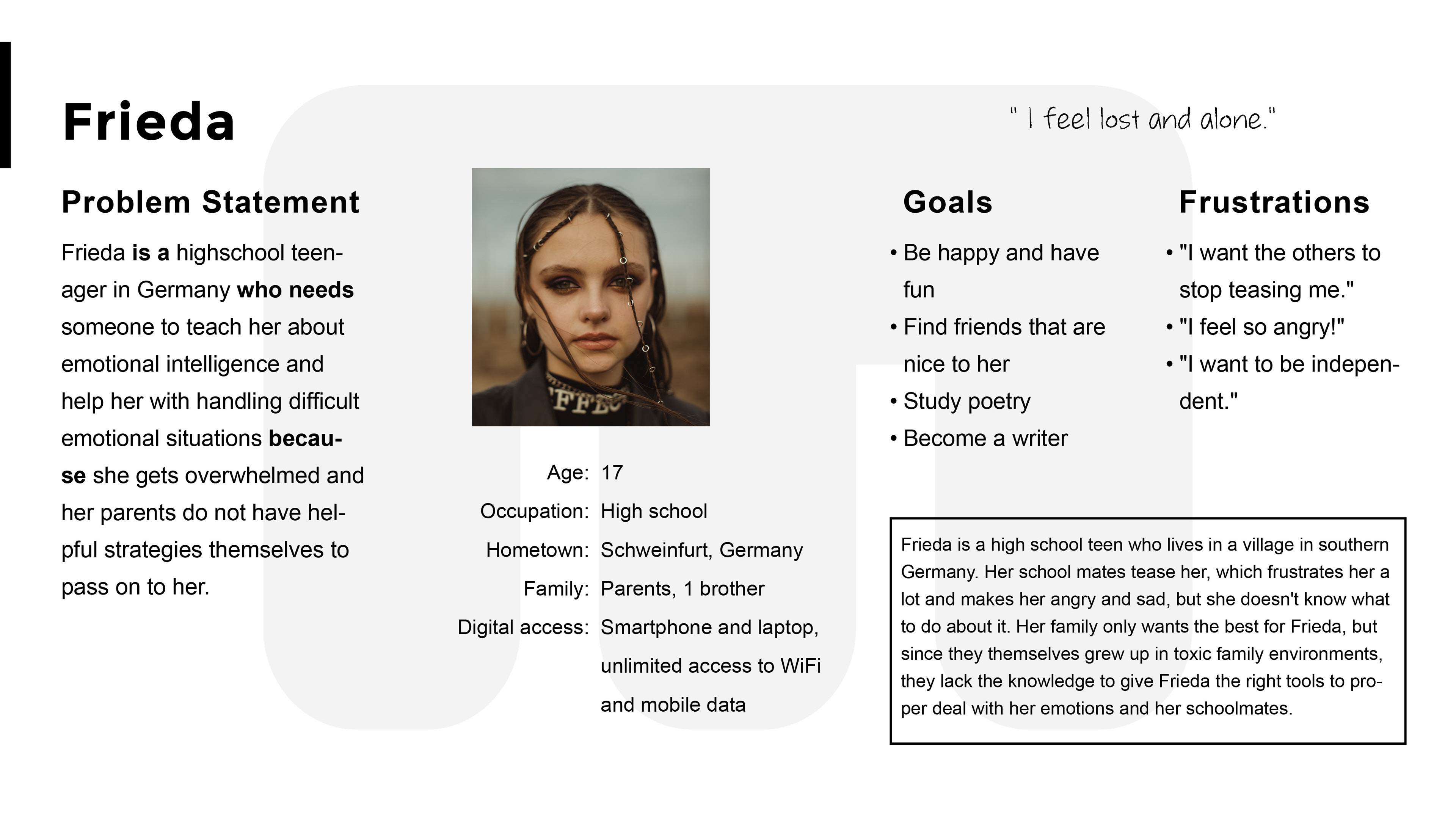
I empathized and analyzed the users further by creating user stories, personas, and problem statements.
Creating and analyzing user journey maps helped me understand how and where they will use the product.
Competitive Audit
Based on the task, I decided to develop a concept for a mobile game. I looked at several potential competing companies, their games, and their online reviews. In addition, I took the time to play some games myself over the duration of this project in order to best understand the subject matter I was working in and what motivates people to play a game on a daily basis and over a long period of time.
3. Ideate & Design mobile App
Design Approach
Since the target audience uses mostly mobile devices, especially smartphones, I decided to apply the mobile first / progressive enhancement approach (= design from the smallest to the largest screen) starting with the mobile app.
Since the target audience uses mostly mobile devices, especially smartphones, I decided to apply the mobile first / progressive enhancement approach (= design from the smallest to the largest screen) starting with the mobile app.
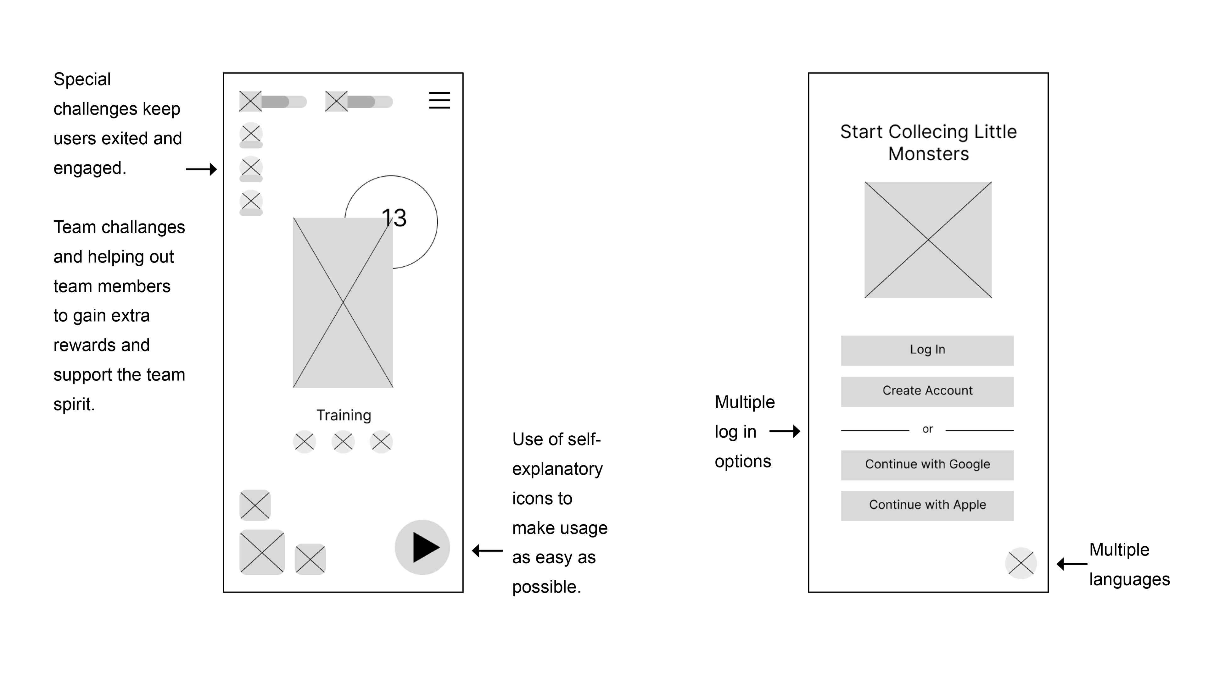
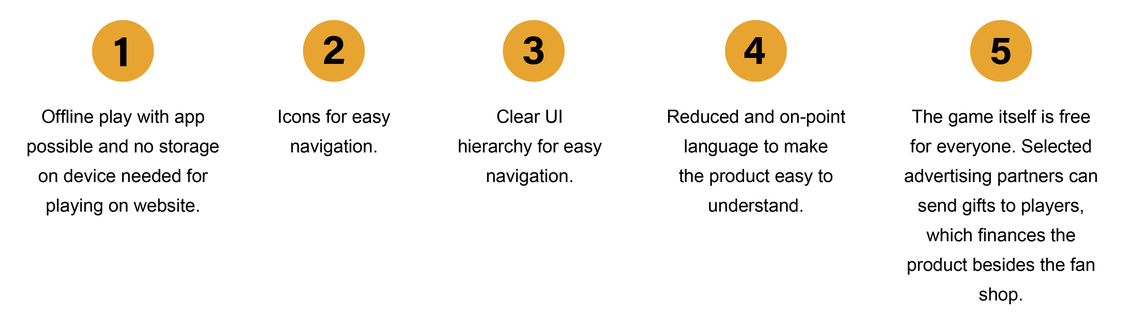
The focus is also particularly on the "Next Billion Users", for which the product must be usable, so the following must be considered throughout the development process:
--- Reduced load time
--- Limited data (prepaid)
--- WLAN is not accessible everywhere
--- Multiple languages and minimized text
--- Intuitive interface
--- No modern western minimalism
--- Reduced load time
--- Limited data (prepaid)
--- WLAN is not accessible everywhere
--- Multiple languages and minimized text
--- Intuitive interface
--- No modern western minimalism
Ideation
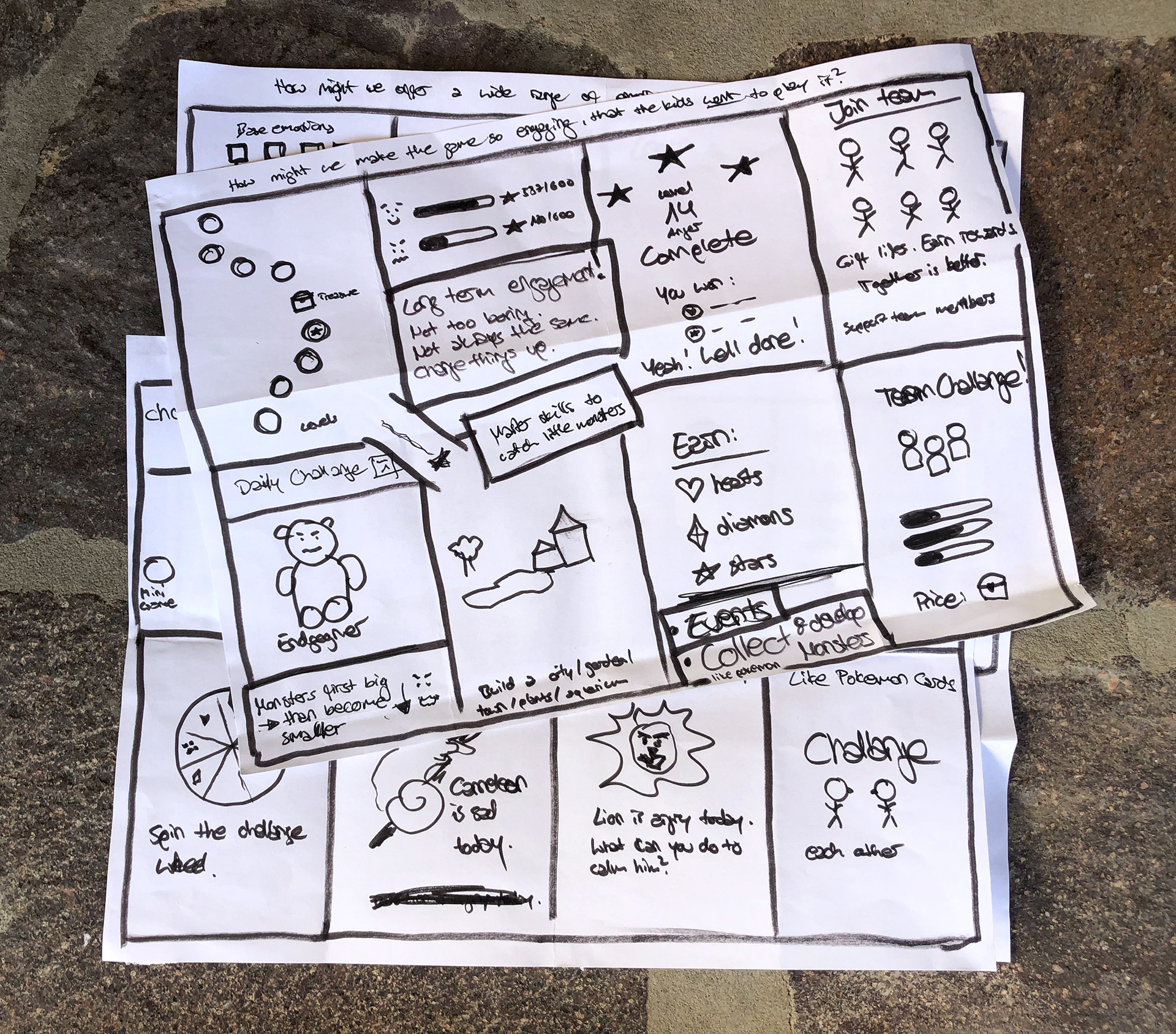
Before I started designing, I gathered ideas using the "How might we?" and "Crazy Eights" ideation exercises.
Before I started designing, I gathered ideas using the "How might we?" and "Crazy Eights" ideation exercises.
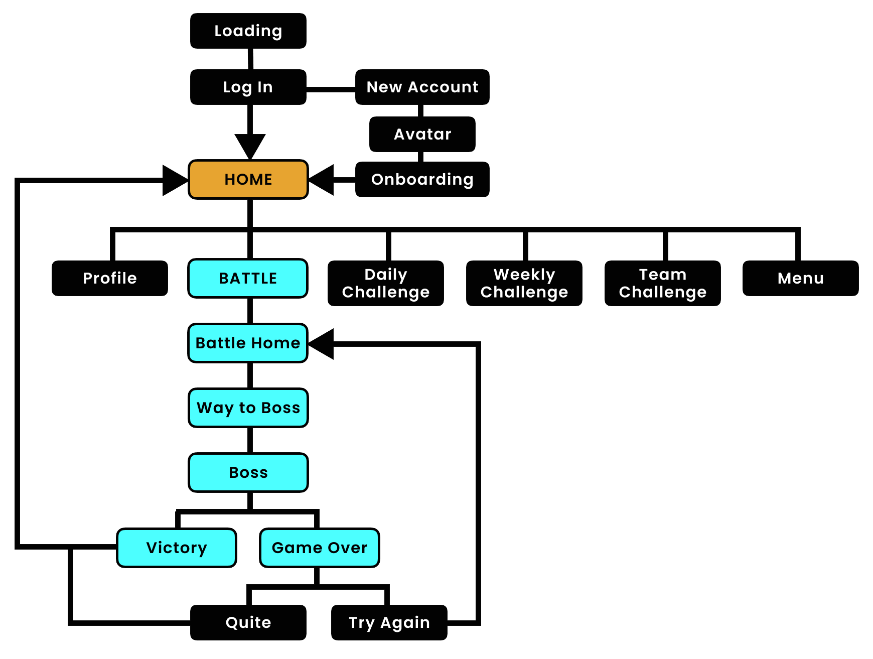
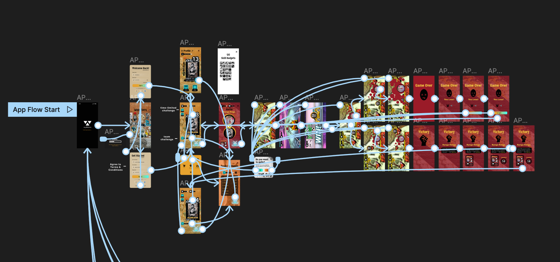
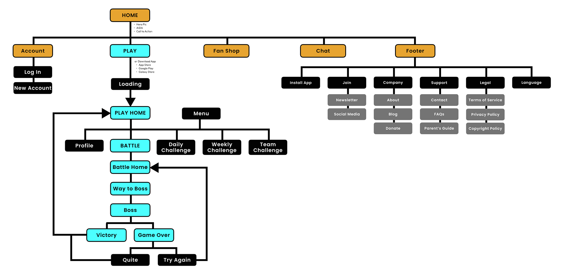
Information Architecture (IA) / Sitemap
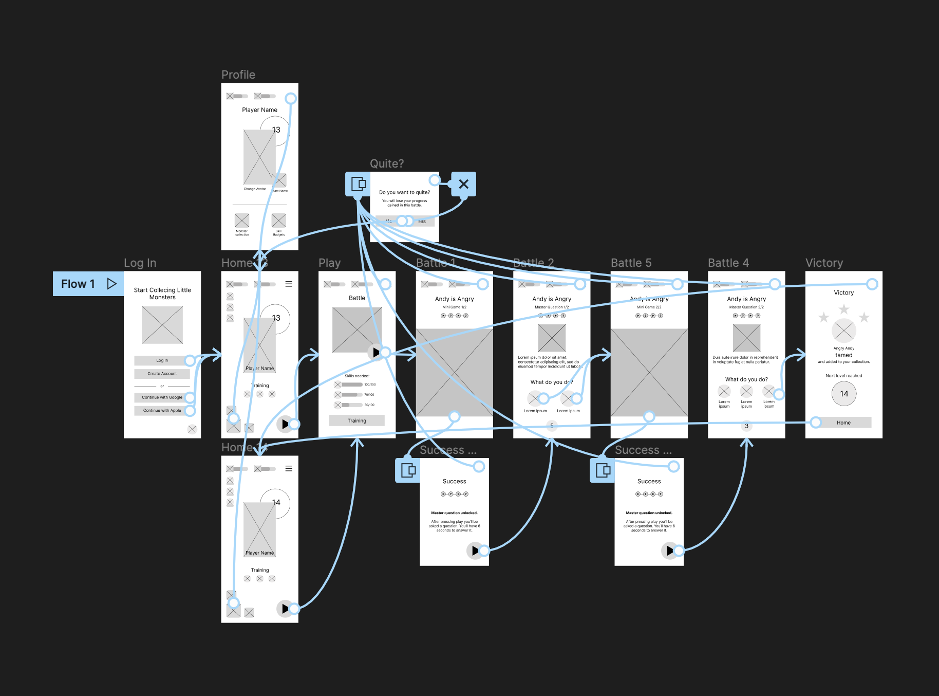
Based on the insights of user goals and what a basic user flow looks like from start to finish, I was able to understand the ways users will interact with the app and created the sitemap based on these insights.
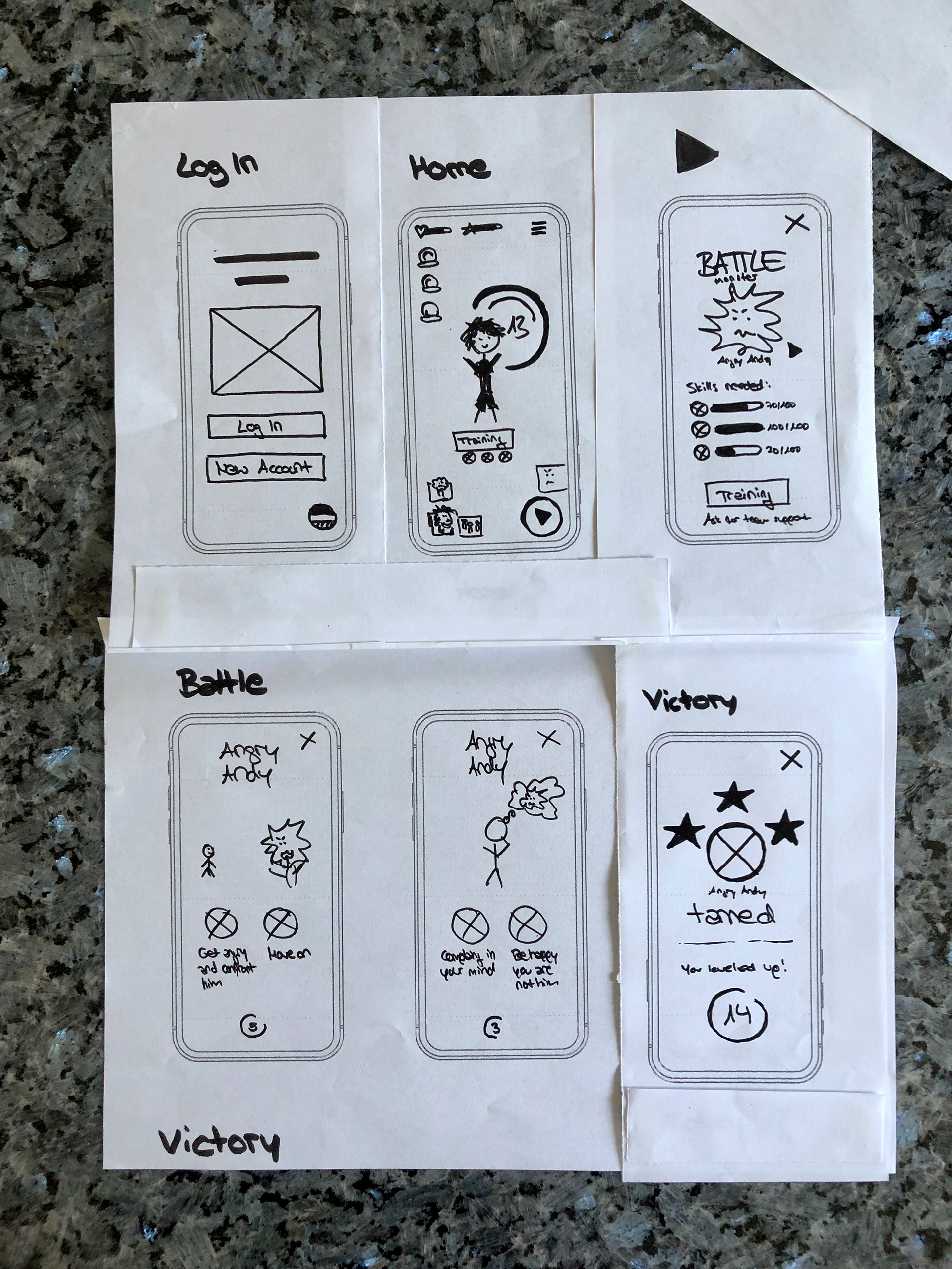
Paper wireframes
Taking the time to draft iterations for each screen of the app on paper ensured that the elements that made it to digital wireframes would be well-suited to address user pain points.
For the game home screen I prioritized the use of easy to understand icons.
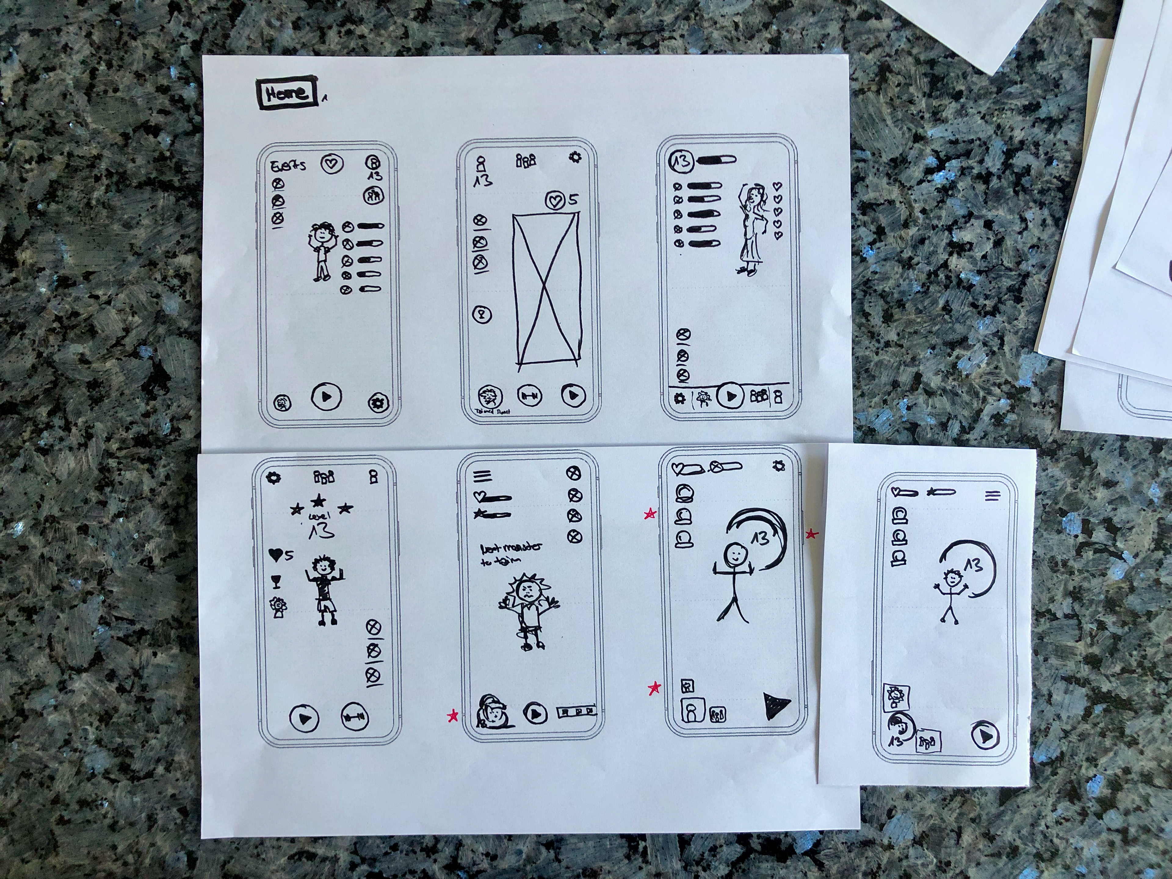
Stars were used to mark the elements of each sketch that would be used in the initial digital wireframe.
Digital wireframes
Based on the results of the paper wireframe development, I created digital wireframes.
Low-Fidelity (lo-fi) Prototype
The lo-fi prototype connected the primary user flow so that the prototype could be used in a usability study with users.
Usability Study
I conducted 2 rounds of usability studies. As the initial design phase continued, I made sure to base screen designs on feedback and findings from the user research
Findings from the first unmoderated study with the lo-fi prototype helped guide the designs from wireframes to mockups.
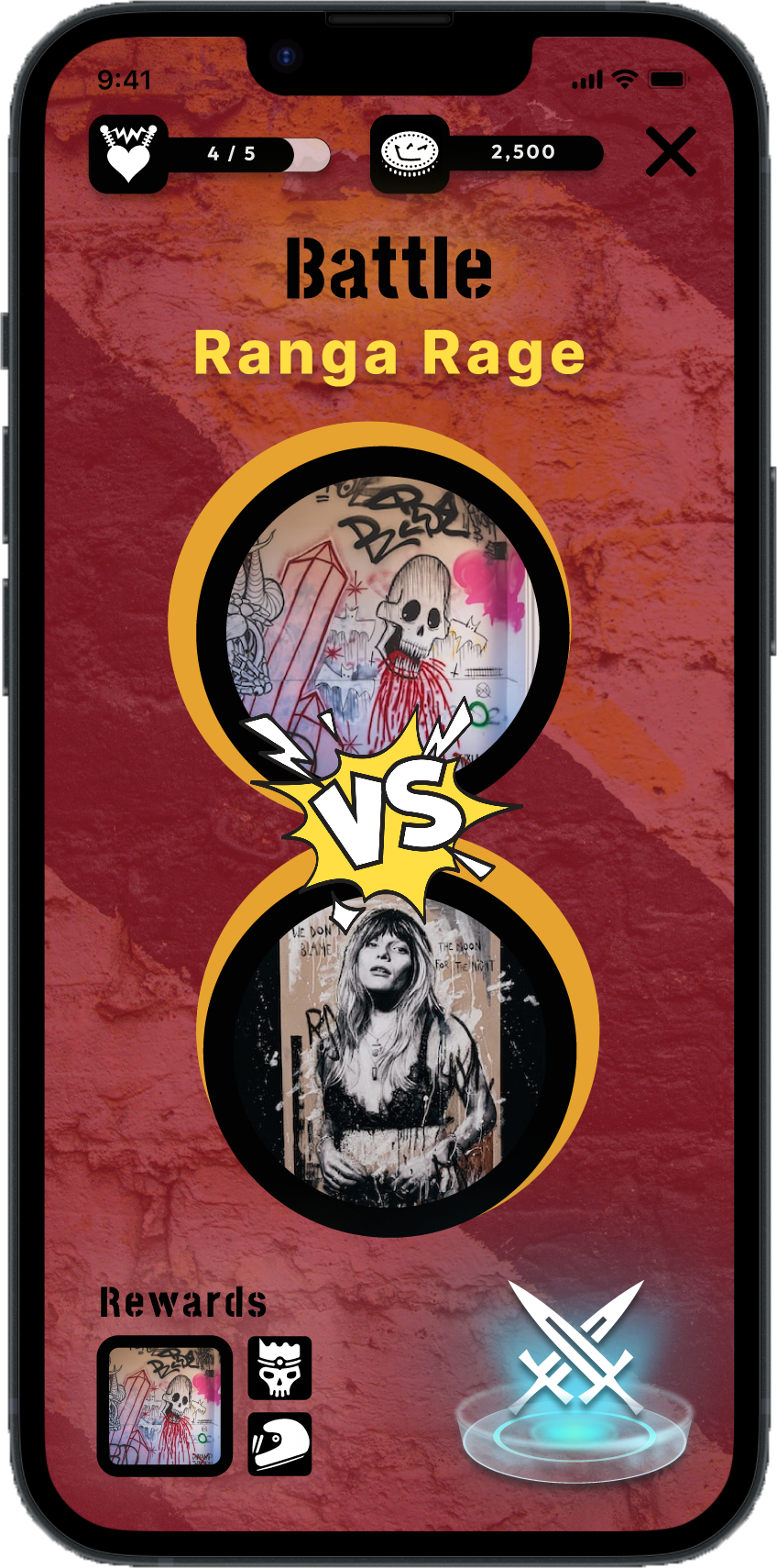
1. Users want to be warned with a confirmation popup before exiting battle mode.
2. Users need more exiting battles than simply answering questions.
3. Users want more icons for easy and comfortable use.
2. Users need more exiting battles than simply answering questions.
3. Users want more icons for easy and comfortable use.
The second moderated study used a hi-fi prototype and revealed what aspects of the mockups needed refining.
1. Users want a confirmation popup, before the starting the "Way to Boss" and "Boss Battle".
2. Users need animated buttons to perceive that their action worked.
3. Users need to be able to recognize the end of the journey " Way to Boss" and " Boss Battle".
2. Users need animated buttons to perceive that their action worked.
3. Users need to be able to recognize the end of the journey " Way to Boss" and " Boss Battle".
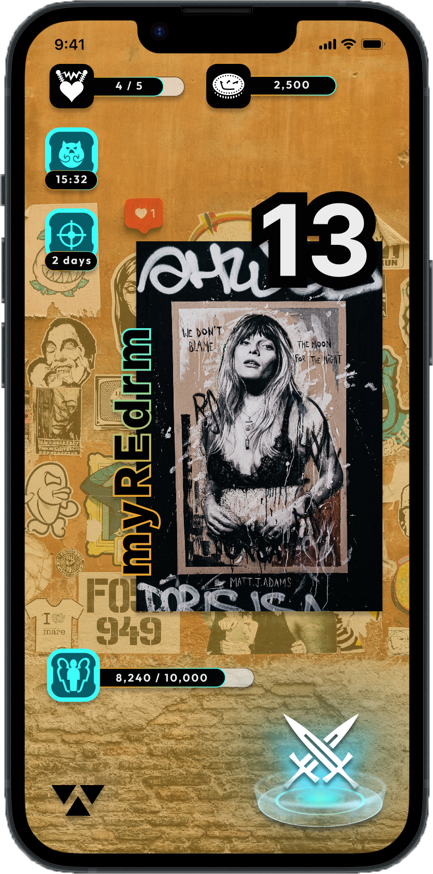
4. Finalizing App Design
Mockups
Design Choices:
- Edgy graffiti style combined with intense colors to "pick up" the cool kids in edgy emotional spots
- Self-explanatory icons
- Confirmation popups before the start of the next combat phase or early termination
- Edgy graffiti style combined with intense colors to "pick up" the cool kids in edgy emotional spots
- Self-explanatory icons
- Confirmation popups before the start of the next combat phase or early termination
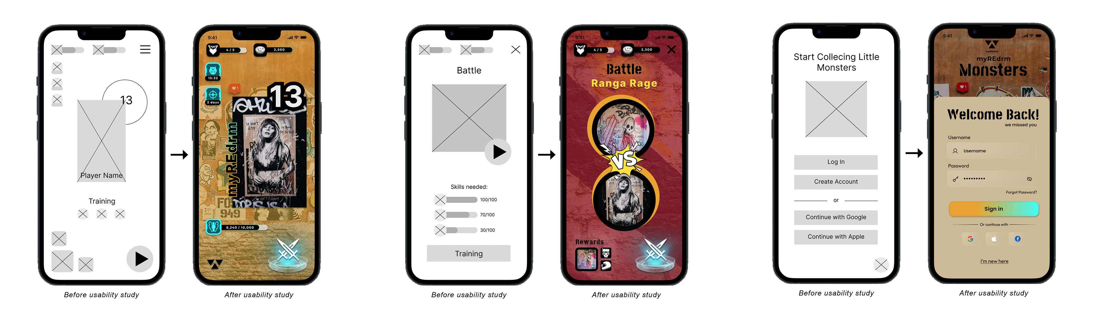
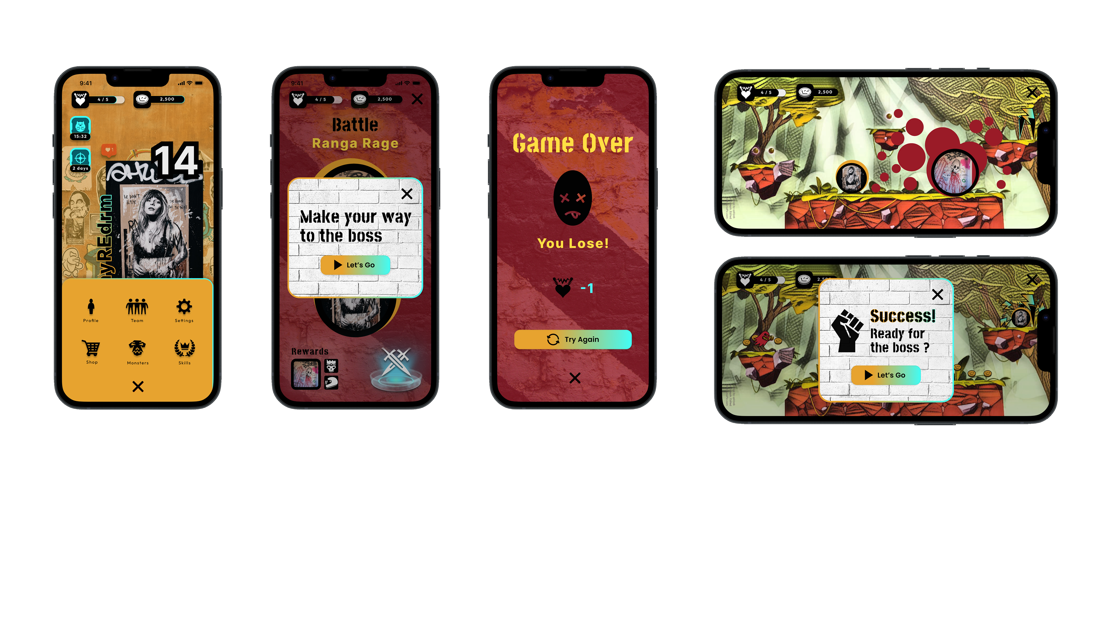
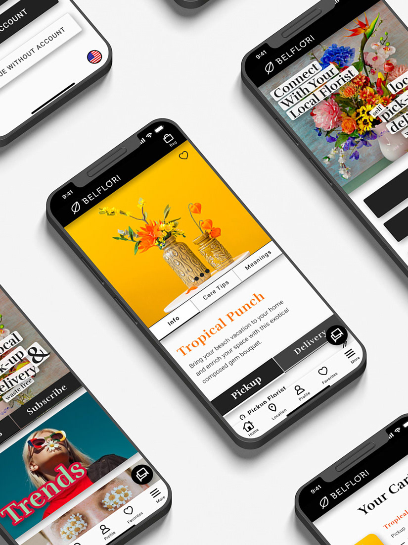
High-Fidelity (hi-fi) Prototype
The final high-fidelity (hi-fi) prototype presented a cleaner user flow and improved visual language.
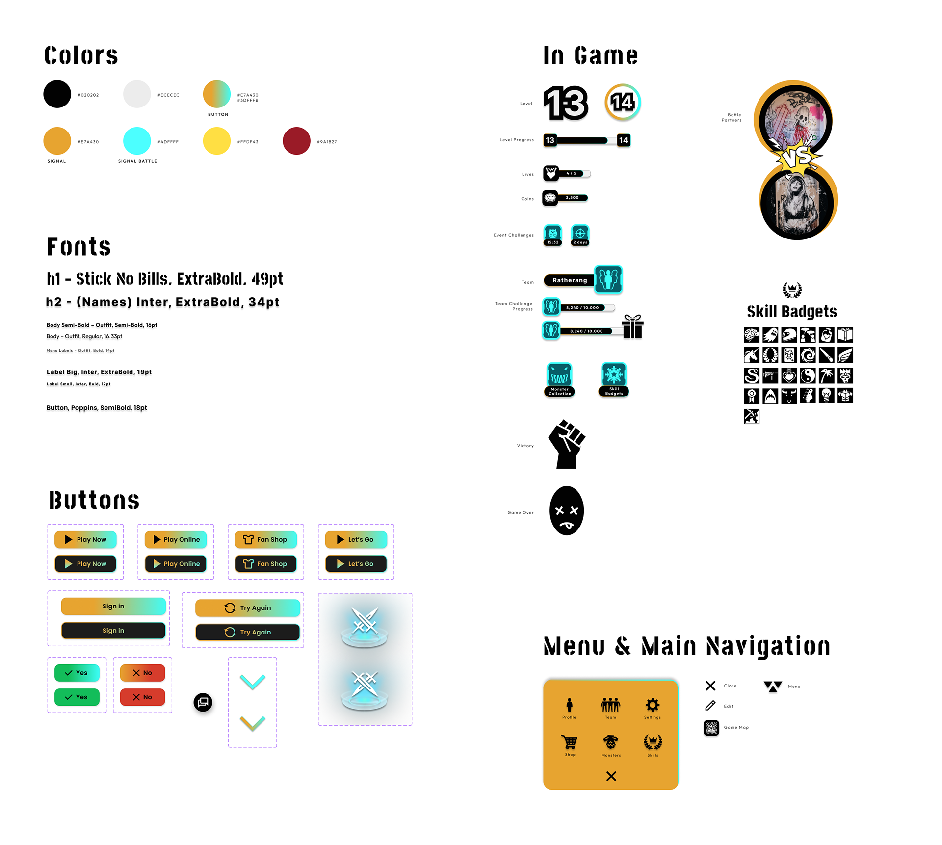
Style Guide / Sticker Sheet
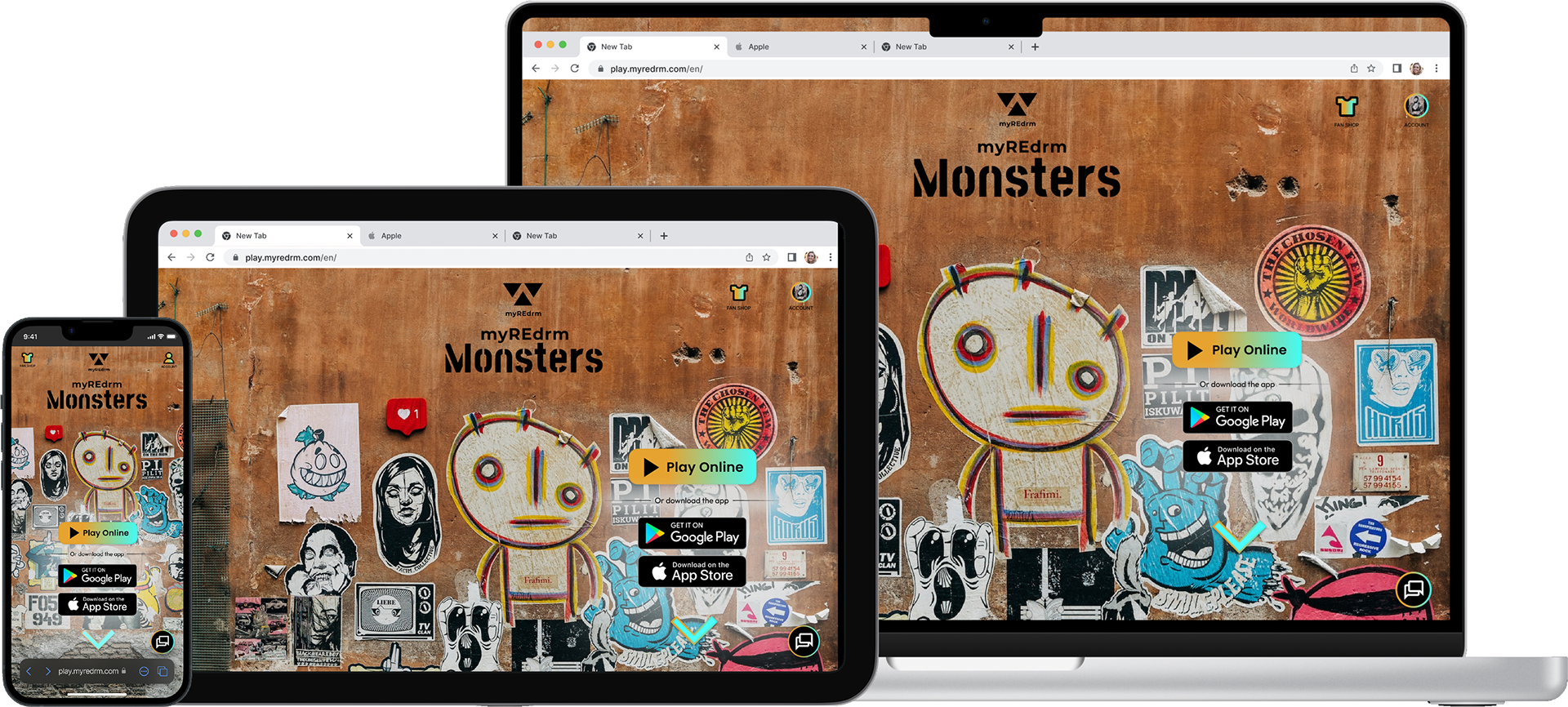
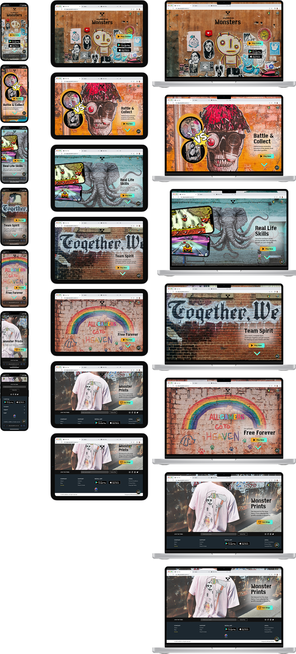
5. Responsive Website Design
Based on the knowledge already gained from the app development, a responsive website was created using the same definition, ideation and design process as previously shown. The website provides general information about the game as well as the possibility to play the game online.
Sitemap Website
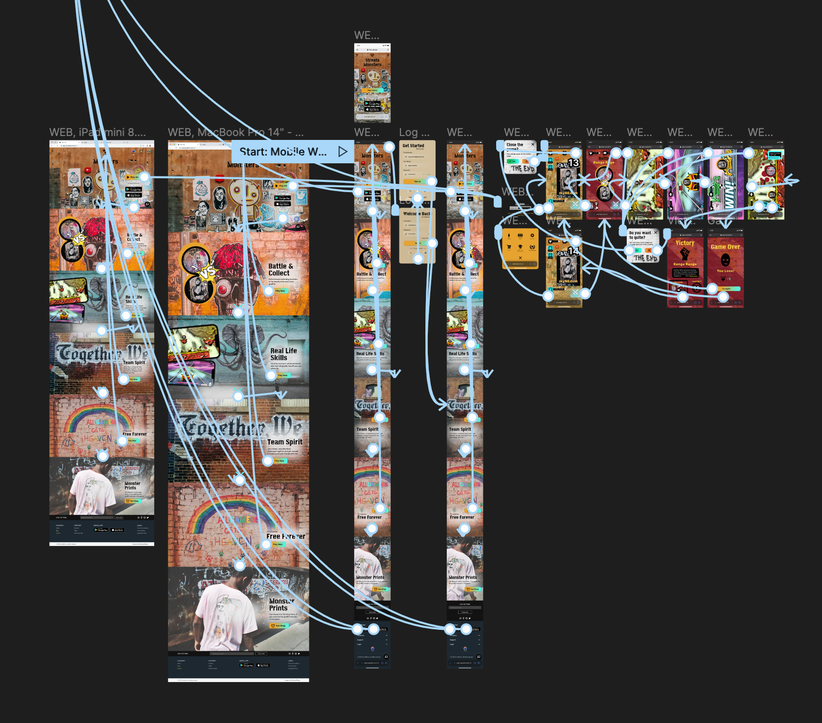
Figma Prototype Screenshot
6. Test the Prototype
Test the website and app on iPhone 14 in Figma:
Accessibility Considerations
5. Going forward
Takeaways
Impact
Feedback from users showed that the game was well received visually and thematically, and that there is a desire to continue playing the game. The guardians of the teenagers and young adults are also very much in favor of the concept. The hope to finish developing the game was expressed several times.
What I learned
During this project, I especially learned to focus on the needs of Next Billion users and understood how to use components in Figma. Even though I faced challenges on the way, diligently going through each step of the design process and aligning with specific user needs helped me come up with solutions that were both feasible and useful.
I also learned how to make learning fun and how to make the world a better place by teaching emotional intelligence. Besides, I realized how big and fun the gaming industry is.
Next Steps

Thank you for your time reviewing my work on this app and responsive website!